The Shrinking Classic: When Cost-Cutting Clashes with Cicero
A classic of Roman philosophy is being silenced not by time, but by "shrinkflation," as Penguin’s latest edition of Cicero reportedly sacrifices readable fonts and basic ink quality to cut costs.
⭐⭐
1/19/20263 min read
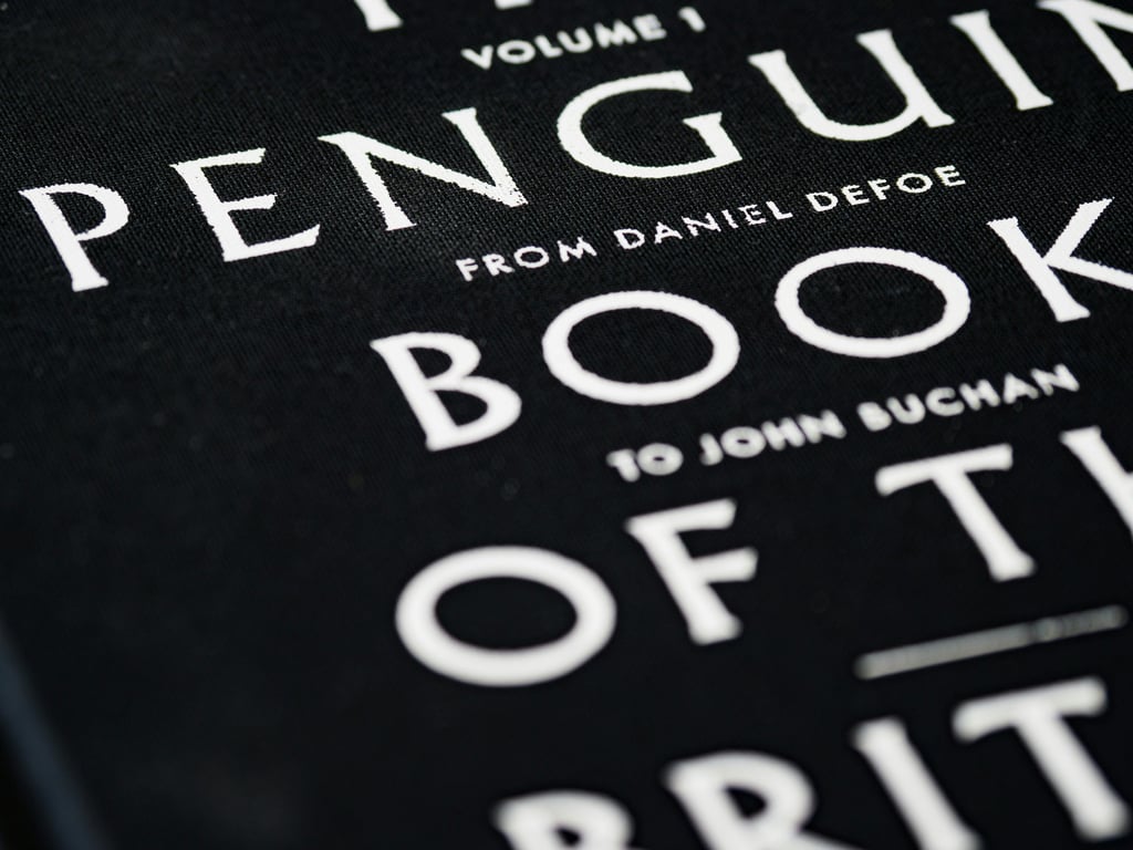
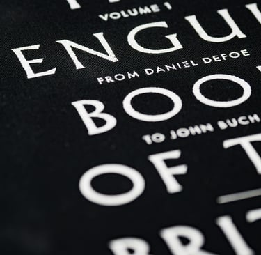
In the world of publishing, few logos carry as much weight as the orange and white stripes of a Penguin book. For decades, Penguin Random House has been the custodian of the "Classics," promising affordable, high-quality literature to the masses. However, a recent authors review (or rather, a reader's technical audit) by Izzy suggests that the "Great Ideas" series may be suffering from a modern ailment: the sacrifice of legibility for the sake of the bottom line.
This is the story of a reader who sought the wisdom of the Roman statesman Cicero, only to find that the greatest barrier to his philosophy wasn't the Latin translation, but the physical printing itself.
The Review in Full: A 2-Star Technical Failure
Rated: 2/5 Stars by Izzy
"Text smaller than newspaper font. Unreadable typeface in ‘Selected Works of Cicero’, just so disappointed as I really wanted to read this book. Its text is much smaller than newspaper font and many sections appear to be printed in distorted illegible italic. To illustrate my point, the original penguin edition from fifty years ago was 110 pages longer due to its normal-sized typeface compared to this recent printed edition. Furthermore, the ink seems fainter on some pages compared to others with text missing due to printer-skipping and inadequate ink. For the avoidance of doubt, all the other penguin copies in-store at Waterstones and elsewhere suffer from these printing defects. Like another user said, such cost cutting methods are compromising the reader experience."
The Story: The Disappearing Ink
Izzy’s experience highlights a growing tension in the publishing industry: the transition from traditional offset printing to "Print on Demand" or high-speed digital runs. The basis of this review is a side-by-side comparison that serves as a heartbreaking "Shortcoming" for bibliophiles. When a book is 110 pages shorter than its 1970s counterpart, it isn't because the content has changed but it’s because the typesetting has been compressed to save on paper costs.
The Atmosphere: The "Waterstones" Reality Check
What makes Izzy’s review particularly stinging is the "boots on the ground" verification. By checking copies at Waterstones, a major UK bookseller, Izzy confirmed that this wasn't a one-off "lemon" from the press. It is a systemic issue within the current print run of the Selected Works of Cicero.
The atmosphere Izzy describes is one of frustration, standing in a beautiful bookstore, holding a classic title, and realizing that the "humanizing connection" between author and reader is being severed by a "distorted illegible italic" font.
The Curation: Quality Control vs. Quantity
The success of Penguin has always been its Curation by bringing "Selected Works" to a broad audience. But as Izzy notes, the Human Element of quality control seems to be missing in this edition.
The Ink Issue: "Printer-skipping" and "inadequate ink" are signs of a manufacturing process pushed to its limit.
The Legibility Factor: A font smaller than a newspaper (typically 8pt or less) is a significant accessibility barrier, especially for older readers or those with visual impairments.
The Shortcomings: The Cost of the "Cheap" Classic
The "Shortcoming" here is a phenomenon known as "shrinkflation" in the book world. To keep the price point of a Penguin Classic low, the publisher may reduce the paper weight and font size. However, as Izzy points out, if a book is "unreadable," its value drops to zero regardless of the price.
The comparison to the edition from fifty years ago is a powerful reminder of a time when the "Reader Experience" was the primary metric of success, rather than the optimization of "ink-to-paper" ratios.
A Classic in Crisis
Izzy’s 2-star review is a clarion call to Penguin Random House. It reminds the giant of the publishing world that while they own the "Great Ideas," those ideas are useless if they are trapped in a "distorted italic" cage. For now, the "Selected Works of Cicero" remains a beautiful object on the shelf, but a "disappointing" experience for the eyes.